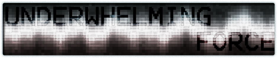

An alternate DATUM album art; ultragritty. Unfortunately, I can’t show all it’s 2000×2000 glory here, because the file is huge.
An alternate DATUM album art; ultragritty. Unfortunately, I can’t show all it’s 2000×2000 glory here, because the file is huge.

This is a good cover. However, at a cursory glance, one immediately thinks of asphalt pavement, which is in sharp contrast with the comparatively clean and technological feel of previous covers, songs, and the word Datum itself. In short, it looks great, but is a bit thematically dissonant. I’m guessing you used the sharpness tool a whole lot to get this effect?
I’m not really trying to have a consistent style between albums; In fact, I’m making an effort to not have exactly the same style between albums. It’s way too easy to just to the same thing over and over only changing the basic melody/shapes. I don’t want to fall into that.
If the blur was removed and the grain made a bit coarser, it would look a bit more like static, which may be more what was intended to be for this cover style.
The problem is compression. With the large file size I’m working on, a lot of the grain was lost in compression.
A) Good point, branching into different things is important.
b) I see.